Friday, 8 April 2011

Eval Q4

4. How did you use media technologies in the construction and research, planning and evaluation stages?

There are many new technologies that I have used throughout creating my product.

RESEARCH:
When researching existing products in order to give inspiration for my own trailer i used media technologies such as POWERPOINT to collect information together and present it in a tidy way that was easy to read and understand.

PLANNING:
After taking photos on the day of filming my trailer i organised them and used PREZI.com to create an interactive powerpoint describing my thought processes and eventually coming to a conlusion as to which product i should use for my ancillary products


when creating my product i made good use of a Video Camera and used a TRIPOD to ensure my shots we still and more professional looking.
when creating my magazine front cover and poster i used an SLR CAMERA to take my images. this high quality camera ensured that my pictures looked the best they possibly can

iMovie -
voiceover tool
music cutting

in my evaluation in
advanced tools;
i used picture in picture to give a more interactive feel

Photoshop, within that:
magnetic tool - lasso and free hand
fill effects - giving a more professional effect
airbrushing - lens blur

iphoto
saturation and brightness - editing my photos
enhance

Eval Q3 - Audience Feedback

3. What have you learned from your audience feedback?


Eval Q2

2. How effective is the combination of your main product and ancillary texts?


1. After watching my trailer, do you think my ancillary products go well with my trailer?

2. What do you think of the outcome of my film poster?

3. What do you think of my magazine front cover?

4. What aspects of my products do you think look professional?

Saturday, 15 January 2011

Development of Magazine Front Cover

Here is the development of my magazine front cover. First I began with a striking image of the main protagonist and then decided on the theme of black and white with a red font which would be aesthetically pleasing and stand out on the shelves. I slowly and carefully layered different effects on to the front cover and I made sure I featured details, which I feel give a more professional effect.


Film Magazine Analysis

Here are two videos with a voiceover of me analysing two film magazine covers. The things I learnt from the analysis are that I need to inculde my main protagonist from the film and feature them on their own. A close-up shot appears more effective. Use of a linking font and theme are also essential!


Development of Poster


Tuesday, 4 January 2011

Development of Teaser Poster

Final Draft of Teaser Poster


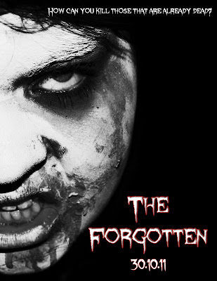
Above is the final draft of my teaser poster. Using the font I chose for my products, I wrote the name of the Film and the date it would be released. Then the slogan at the top of the poster. As it's a teaser poster it contains very little information unlike a normal poster. I like the outcome of it as I think it's eye catching and effective.


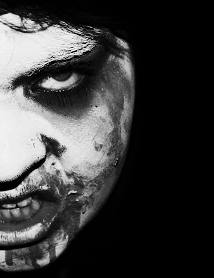
This the working progress of my teaser trailer. This is the image I decided to use in the end as I feel it will work well with my target market. I've edited the image above in photoshop to make it more effective. Firstly I made a blank document (international paper) then filled the background in black. I then cropped my original image so only half of the zombie face was viewable, shrouding the character in a certain amount of mystery. I then blended the face with the background using the eraser tool on a low hardness and opacity, so only the actual face was visible, rather than the hair, neck and clothing. Once I was happy with outcome I began to edit the image using different processes. Firstly I made the image black and white. I then heightened the saturation and made the contrast brighter. This gave the light parts of the image lighter and the same with the dark parts.

Below is the original image that I began with:

Thursday, 9 December 2010

Auxiliary Product Development

When designing a poster for a film you have to ensure that your poster has a linking element to your film - most importantly your trailer. These are the two most popular marketing platforms and depending on how they are made, can make or break a film. Throughout all my products I intend to have a linking font. Meaning I will use the same font for the name of my film on my trailer and on my poster. If the consumer sees the trailer on television then the poster at a bus stop for example, using linking themes enables them to identify these products as one.

I have chosen the 4th font down, Sycanthorpe. I don't think it looks too cartoony, and I can imagine it being used in a profession trailer. I will use this font to combine all my products together.

Below, are all my options for the font regarding my poster, and the one I'll be using in my trailer.


Trailer Outcome

Footage

Below is some short clips of my footage to give an idea of my shots and locations. I will then sort my footage out, choosing what works best to create my trailer. I will then add a soundtrack, special effects and whatever else neccessary to create my trailer and make it successful.

Monday, 29 November 2010

Character Profiles

Character profiles are important to give to the actors participating in your film as they allow the actor to understand what they will be doing and they can get to know the character they are supposed to be playing.

Wednesday, 20 October 2010

Research for Auxillary Products

Film Posters Analysis

How can I apply my findings to my own product?In conclusion, horror film posters generally have very dark and mysterious colour schemes. Red writing appears popular and also is effective as it connotes either blood, danger or death. In both the posters that I analysed, the main feature was close-up photos of people, what both look like to be female. When creating my own auxillary products I will aim to include these features so my work is as professional looking as possible.


This is the promotional poster for the film 'Infected'. The colour scheme used in the poster is very dark, using practically only black and very dark greys and blues. The poster overall is striking despite having a dark palette. The name of the film coinsides with the image featured. The extreme close-up of a clearly 'infected' persons face is quite disturbing therefore being effective and attracting the target audience. From further research, I have discovered that the symbol inside the persons eye is in fact the sign for an infected area, linking in with the title of the film. Overall, the poster appears quite simplistic only using the disturbing portrait photo and the name of the film with informtion below. Even though there is quite a lot of writing below, you are still drawn to the image and name of the film as the main focus, therefore the poster has successfuly acheived what it's made to do. You can easily establish the genre of the film and even roughly guess some of the storyline. The tagline, 'How can you kill what is a part of you?' gives the viewer a vague idea of what the film's about but still raises important questions resulting in people going to see the film as they want these queries answered.


This poster is for the horror film The Grudge. At a first glance, the image for the poster is quite disturbing. It features what looks like a girls portrait but a lot of her face is covered by hair and the only part of her face that you can see is her eye. You can tell that her facial expression is that of shock and she looks scared. This emotion is trying to be passed on to the viewer and could make them feel uncomfortable and feel quite scared, giving the impression that the film is scary too. As my target audience get a 'thrill' from horror movies they will be interested in this film and will most probably have a positive response to this particular poster. The overall look of the poster is very dark and mysterious, the audience are not given much to go by, but it keeps them guessing ultimately making them want to go and see the film. The colour of the font given for the name of the film is bright red contrasting greatly to the rest of the poster. This makes it stand out so the target market immeadiately see the name of the film, then at a closer look the features of the girl. Red has connotations of danger and blood and so this also fits in with the genre of horror. The tagline 'It never forgives. It never forgets.' is quite haunting and is easy to remember, but also asks questions about the film. These questions can only be answered by people going to see the flm for themselves, ultimately resulting in a successful horror movie.

Pitch

All good pitches should be simple to explain and to understand. Here is the idea of my film in just 25 words.

A girl tries to leave home as she's feeling neglected by her family. Instead she's forced to endure the torture two zombies inflict upon her..

Horror Movies & Influences


Horror Films are unsettling films designed to frighten and panic, cause dread and alarm, and to invoke our hidden worst fears, often in a terrifying, shocking finale, while captivating and entertaining us at the same time in a cathartic experience. Horror films effectively center on the dark side of life, the forbidden, and strange and alarming events. They deal with our most primal nature and its fears: our nightmares, our vulnerability, our alienation, our revulsions, our terror of the unknown, our fear of death and dismemberment, loss of identity, or fear of sexuality.

Whatever dark, primitive, and revolting traits that simultaneously attract and repel us are featured in the horror genre. Horror films are often combined with science fiction when the menace or monster is related to a corruption of technology, or when Earth is threatened by aliens. The fantasy and supernatural film genres are not synonymous with the horror genre, although thriller films may have some relation when they focus on the revolting and horrible acts of the killer/madman. Horror films are also known as chillers, scary movies, spookfests, and the macabre.


Influences For My Trailer


Looking at and researching horror movies through the decades I have decided to focus in on the subgenre of the Zombie film. I have look at many zombie films and narrowed my favourites down to the following two films, 'The Crazies' and 'Dawn of the Dead'. I have decided to study zombie films as this is a very popular category among my target audience. The vast majority of zombie movies are certificate 15 and this is what I am using for my film.
Below are the trailers for my two major influences:

The Crazies:


Dawn of the Dead (Here is the link for this trailer as embeding was disabled on youtube):
http://www.youtube.com/watch?v=8LUzJAsa-gg

I really like both of these trailers as they follow the structure of a horror trailer; a scene being establishes, something bad happening forcing the main characters to try and overcome an obstable, and then that thing that keeps the audience interested; will the obstacle be overcome? Both trailers are fast-paced and also fit in with my chosen subgenre of a zombie movie. These two trailers will influence me a lot and I will refer to them when creating my own trailer.

Mood Board, Genre & Target Market

After extensive research and planning such as analysing existing products and producing a questionnaire, I have come to the conclusion that my target market is teenagers, specifically ages 15-18. I feel that as this age bracket are my peers, I can connect to them and understand their likes and dislikes so I can create a good trailer.
The genre of my trailer will be a Horror movie because that is what is most popular amongst my target market. Teens my age are interested in horrors because they are tense, interesting and keep you on the edge of your seat.
I also continued to research futher into my target market by creating a mood board which you can find below. This has helped my further my knowledge and I know have a sound understanding of what my peers percieve to be a good trailer.

Questionnaire Results

Tuesday, 19 October 2010

Questionnaire

Creating a questionnaire will help to establish who my target audience are and what type of film genre they like. I will take the results from this and apply them to my product, creating something as successful as possible.

Monday, 18 October 2010

Aims for the week..

Get storyboard filmed, edited and uploaded as an anamatic. - Sound effects and transitions

Set up logistics of filming over half term - equipment, who, what, when, where etc.
Create a 'shooting schedule' for this.

Pick out 5 points from your research that you'll include in your trailer

Friday, 8 October 2010

Focus Group


Name: Brooke Rayner
Age: 17
School/College: Southend High School For Girls
Subjects: Media, English Literature, Business
Favourite Film Genre: RomCom
Favourite Film(s): Hitch, Thumbelina
Favourite TV Channel: BB1, Channel 4, E4
Favourite Magazines/Newspapers: Heat, More, The Sun
Websites Frequently Used: Facebook, Google, YouTube


Name: Holly Dibden
Age: 17
School/College: Southend High School For Girls
Subjects: Product Design, Media, Sociology
Favourite Film Genre: Comedy
Favourite Film(s): The Bounty Hunter, The Last Exorcism
Favourite TV Channel: MTV, E4
Favourite Magazines/Newspapers: Q, Kerrang
Websites Frequently Used: Facebook, Twitter, Tumblr


Name: Sophie Evangeli
Age: 18
School/College: Coopers
Subjects: Physics, Chemistry, Biology
Favourite Film Genre: Thriller
Favourite Film(s): Armageddon, Spiderman
Favourite TV Channel: E4, Sky Movies
Favourite Magazines/Newspapers: Daily Mail, Now/Heat
Websites Frequently Used: Facebook, Online Programme Players


Name: Milly Mason
Age: 18
School/College: Gap Year
Subjects: Business Course
Favourite Film Genre: Comedy/RomCom
Favourite Film(s): Pretty Woman,
Favourite TV Channel: Music Channels, Movie Channels
Favourite Magazines/Newspapers: Look/More/Heat
Websites Frequently Used: Facebook, iTunes

Analysing a trailer: Horror

How can I apply my findings to my own product? I know how a working knowledge of the conventions of horror movie trailers and what makes them effective and successful. If I choose to create a horror movie I will understand how to produce something that will appeal to my chosen target market.


Here is a video of me talking about the trailer House Of Wax and analysing it.


Below is a text copy of what I read out.

Analysing A Trailer: RomCom

How can I apply my findings to my own product? I have now discovered the basic conventions of Romantic Comedies and how they work and re successful. If I were to choose to base my idea on this genre I will have a good knowledge of how to create a strong one.


Here is a video of me talking about the trailer P.S I love you and analysing it.


Below is a text copy of what I read out.

Marketing Platforms & Conventions

How can I apply my findings to my own product? I have learnt that the cinema is an effective platform to showcase trailers on. You can show the trailer alongside films that have a similar genre, therefore the audience might be more likely to be interested in the film. I will apply this knowledge to my auxiliary products, eg. with my decided film genre, create my magazine review in a magazine that is geared towards my chosen genre. Regarding the conventions powerpoint, I have learnt some of the key conventions to a successful trailer. I will take these on board and try to include as many as possible so my final product is professional and strong

Where do you most commonly see film trailers?

The most common place I see film trailers is on the television. This is without purposely seeking them out, if I am watching a programme and there are adverts with the trailer then I will watch it. If I purposely want to watch a trailer then I will use 'youtube' but sometimes this can be unreliable as they do not always have the official trailer. I often check the Apple website for the newest trailers as they contain the upcoming releases and you can view them normally or in HD. The website also features information about the films and has links to the official film websites.


I think that the different locations you can view the trialer do change your response to it, for example if I were to watch a trailer in the cinema, I would have no choice but to sit there and view it, whereas if viewing online, it is so simple to just exit the trailer or skip past it if it does not interest me. A cinema almost 'forces' you to watch it and you can place it before films that have a similar genre to your film, therefore being a more effective marketing platform.

Conventions Presentation:

Wednesday, 15 September 2010

Trailer Theory

How can I apply my findings to my own product? I have learnt that there are many types of marketing elements when creating a film and although a trailer is an important aspect, there are many others such as posters or websites. From research into a particlular film, I have found that linking all products together in even a simple way such as the colour scheme, makes for a much stronger set of products and they will have a professional and mature look to them.

1. What do you think are the major elements of a film marketing campaign - the different ways in which the film's 'message' is presented to potential audiences?

The marketing campaign plays a vital role in informing potential audiences about a film with the purpose of encouraging people to see the film at the cinema. Film marketing has many different elements and it's a multi platform business, enabling promotion using many different technologies.
Some of the major elements of a film marketing campaign are all the different types of advertisments. The trailer is one of the most important marketing elements and will give the potential audience an idea of what the film is about, hopefully making them want to see it and attracting the intened audience. Focusing in on a particular film regarding this research will help me emphasise my work. Here is the trailer for the film 'Avatar;
The trailer is full of action and there is always something excting happening. A lot of the story is revealed and explained, there is a character intentionally describing the purpose of the film but not as an intentional narrative, which is cleverly done. It is clear to see from the trailer that the film has a massive budget, and it is very much geared towards the writer and director, James Cameron.


Posters are also of great importance as they can be placed practically anywhere. If the poster is made well it can stir interest and make the film a talking point which is ultimately what film makers want. This poster is eye-catching and also aesthetically pleasing. The colour palette of blue is used and appears to be quite calming. The facial expression the person/creature is using is that of serenity and doesn't really show too much emotion. I wouldnt say that this poster gave too much away about the film and would probably make you want to go and see it even more. It is very simple and the only text is talking again about the director. As he has produced some extremely popular films, the marketing company are priding the film on having such a good director, hoping that that will draw the audience in.


Another popular marketing element is a website. If a person takes interest in the film by seeing it being advertised (the trailer or the poster) they can then visit the website and find out more information. As you can see there are so many platforms that the campaign can be reached on, the elements seem to link and work with each other. A website needs other marketing campaigns such as the trailer, likewise, the trailer needs somewhere to be based, eg. a website. One cannot be without the other. The avatar website, like the poster and trailer uses the same colour palette, blues and blacks. This seems a successful strategy as the colour stick in your mind and you immeadiately link them together. The website is very interactive and there are lots of things you can do such as watch the trailer, enter competitions, buy the DVD online and view interviews with the actors and people involved in making the film.


2. Where might you expect to see each of the different parts of the marketing campaign?
A films marketing campaign can include many things. Advertising can be used on so many different platforms, the most common being TV, Radio and Magazines/Newspapers. On television, adverts can be shown, such as trailers between programming. They can be placed between particular programmes that are similar to that of the film, speaking about genre. For example, it is likely that the 'Avatar' film will be featured on the adverts between doccumentaries or dramas that involve lots of action or maybe shown between film channels to target the 'movie buff' audience. Another thing that can be shown on television or online is interviews with the actors in the film. This video shows an interview with James Cameron which was shown on 'Discovery News' about 'Avatar';


On the radio, adverts are also available, obviously without visuals. Small snippets of sound such as quotes or memorable music can be taken from the film and used in the radio advert. Another popular element of the radio advert is to obtain members of the public to give short reviews of the film and what their viewing experience was like.


As well as this, advertising can be used in newspapers and magazines, pages can be bought from magazine companies and used to promote the film with the official poster. Films can also gain interest by having reviews in newspapers and usually have a 5 star rating, reviewing the film.
Marketing can also be used online. Not only as a virtual website but also as adverts on the side of popular social networking websites such as facebook or myspace. Spam email can also be used to target a particular audience or get attention from potential viewers of the film. This is a DPS review taken from 'Ultimate' magazine;


It is clear that the film is a big budget blockbuster as it recieves a whole 2 pages, whereas normally it is most common for a film review to receive a small space on a printed page.


3. What factors make you want to go and see a film? How do you decide which films to see?
The factors that make me want to go and see a film are how exciting the trailer looks and whether it is of a particular genre. I am interested in horror movies and know that trailers for this genre tend to be fast paced with an interesting storyline. If a particular trailer has these aspects then I will most probably go and see the film. If something prides itself on being 'particularly scary' and I have heard people talking about it then I will probably want to experience the film for myself. Word of mouth plays a big part for teenagers like me when deciding to see a film. If my peers have been talking about it then I will most likely be interested and go and see the film with them.


This is a perfect example of seeing a trailer and immeadiately being interested in the film and wanting to see it. Even in the trailer they have taken clips of the general public talking about how scary the film is. They have also included action shots of the reactions of people watching it. This type of trailer would make me want to experience that 'tenseness' for myself, therefore it is more than likely that I would go and see it in the cinema.

Tuesday, 14 September 2010

The Purpose Of Trailers

How can I apply my findings to my own product? By researching in detail about trailers I know have a sound understanding of their purpose and why they are created. This knowledge will enchance my final product.


Friday, 10 September 2010

Proposal for Advanced Portfolio

Name: Poppy Adams

Title of Brief:
A Promotion Package for a new film, including a teaser trailer


Outline of ideas:
Trailer for a horror movie. A small town has been infected and blocked off. (Zombie type movie.) Following the life of an uninfected person trying to live in a place with the infected people, constantly fearing for her life. Using fast-paced editing and quick shots towards the end. Trailer builds up suspense but gradually getting more fast paced and tense and 'panicky'.


Auxiliary Products:
A film magazine front cover featuring the film and a poster for the film


Target Audience: (age, gender, socio/economic group)
Teenagers, Ages 15-19.

How will your media product use, develop or challenge forms and conventions of real media products?
The music will not necessarily be fast paced at the beginning. The trailer will start slow and gradually get faster, this way tension will be built and and conventions will the challenged as it doesn’t start the way it ends.

What is your inspiration?
My inspiration is the film Doomsday and The Crazies

How will your main product and ancillary texts compliment each other?
They will all follow a similar theme, using a similar colour theme such as black and red. Using the same front and image effects will ‘bind’ all the products together.

How will you use media technologies in the construction and research, planning and evaluation stages?
Construction- using imovie and photoshop.
Research- The internet
Planning- word and powerpoint for research and planning

How will you incorporate the following concepts?

Genre – Using dark colours, mysterious music, ‘hidden’ people and scenes

Narrative - Using text on screen for some shots. Not an obvious voiceover narrative but a subtle one using characters to explain the plot.

Representation -

Audience – Using teenagers in the movie, similar ages will indentify with this

Media language