Friday, 8 April 2011

Eval Q4

4. How did you use media technologies in the construction and research, planning and evaluation stages?

There are many new technologies that I have used throughout creating my product.

RESEARCH:
When researching existing products in order to give inspiration for my own trailer i used media technologies such as POWERPOINT to collect information together and present it in a tidy way that was easy to read and understand.

PLANNING:
After taking photos on the day of filming my trailer i organised them and used PREZI.com to create an interactive powerpoint describing my thought processes and eventually coming to a conlusion as to which product i should use for my ancillary products


when creating my product i made good use of a Video Camera and used a TRIPOD to ensure my shots we still and more professional looking.
when creating my magazine front cover and poster i used an SLR CAMERA to take my images. this high quality camera ensured that my pictures looked the best they possibly can

iMovie -
voiceover tool
music cutting

in my evaluation in
advanced tools;
i used picture in picture to give a more interactive feel

Photoshop, within that:
magnetic tool - lasso and free hand
fill effects - giving a more professional effect
airbrushing - lens blur

iphoto
saturation and brightness - editing my photos
enhance

Eval Q3 - Audience Feedback

3. What have you learned from your audience feedback?


Eval Q2

2. How effective is the combination of your main product and ancillary texts?


1. After watching my trailer, do you think my ancillary products go well with my trailer?

2. What do you think of the outcome of my film poster?

3. What do you think of my magazine front cover?

4. What aspects of my products do you think look professional?

Saturday, 15 January 2011

Development of Magazine Front Cover

Here is the development of my magazine front cover. First I began with a striking image of the main protagonist and then decided on the theme of black and white with a red font which would be aesthetically pleasing and stand out on the shelves. I slowly and carefully layered different effects on to the front cover and I made sure I featured details, which I feel give a more professional effect.


Film Magazine Analysis

Here are two videos with a voiceover of me analysing two film magazine covers. The things I learnt from the analysis are that I need to inculde my main protagonist from the film and feature them on their own. A close-up shot appears more effective. Use of a linking font and theme are also essential!


Development of Poster


Tuesday, 4 January 2011

Development of Teaser Poster

Final Draft of Teaser Poster


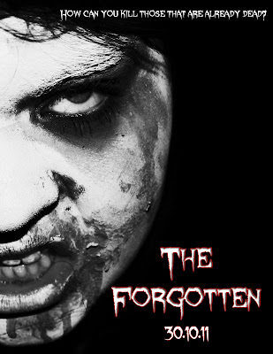
Above is the final draft of my teaser poster. Using the font I chose for my products, I wrote the name of the Film and the date it would be released. Then the slogan at the top of the poster. As it's a teaser poster it contains very little information unlike a normal poster. I like the outcome of it as I think it's eye catching and effective.


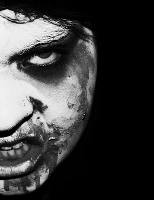
This the working progress of my teaser trailer. This is the image I decided to use in the end as I feel it will work well with my target market. I've edited the image above in photoshop to make it more effective. Firstly I made a blank document (international paper) then filled the background in black. I then cropped my original image so only half of the zombie face was viewable, shrouding the character in a certain amount of mystery. I then blended the face with the background using the eraser tool on a low hardness and opacity, so only the actual face was visible, rather than the hair, neck and clothing. Once I was happy with outcome I began to edit the image using different processes. Firstly I made the image black and white. I then heightened the saturation and made the contrast brighter. This gave the light parts of the image lighter and the same with the dark parts.

Below is the original image that I began with: