Final Draft of Teaser Poster
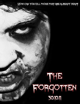
Above is the final draft of my teaser poster. Using the font I chose for my products, I wrote the name of the Film and the date it would be released. Then the slogan at the top of the poster. As it's a teaser poster it contains very little information unlike a normal poster. I like the outcome of it as I think it's eye catching and effective.
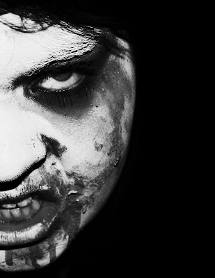
This the working progress of my teaser trailer. This is the image I decided to use in the end as I feel it will work well with my target market. I've edited the image above in photoshop to make it more effective. Firstly I made a blank document (international paper) then filled the background in black. I then cropped my original image so only half of the zombie face was viewable, shrouding the character in a certain amount of mystery. I then blended the face with the background using the eraser tool on a low hardness and opacity, so only the actual face was visible, rather than the hair, neck and clothing. Once I was happy with outcome I began to edit the image using different processes. Firstly I made the image black and white. I then heightened the saturation and made the contrast brighter. This gave the light parts of the image lighter and the same with the dark parts.
Below is the original image that I began with:


